

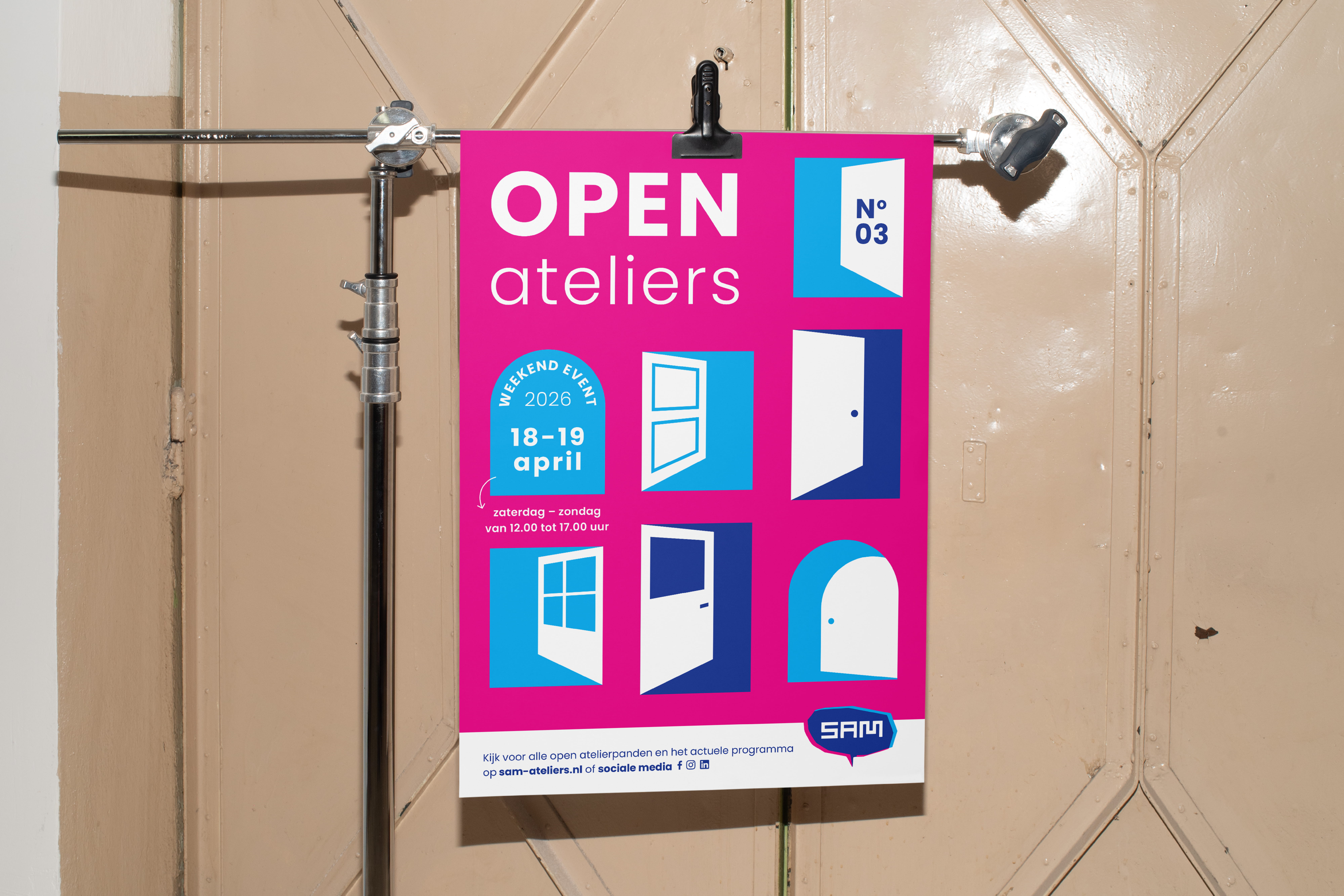
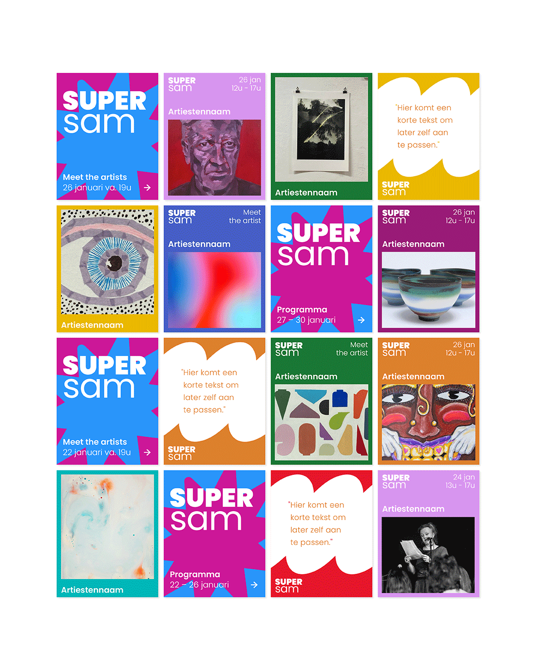
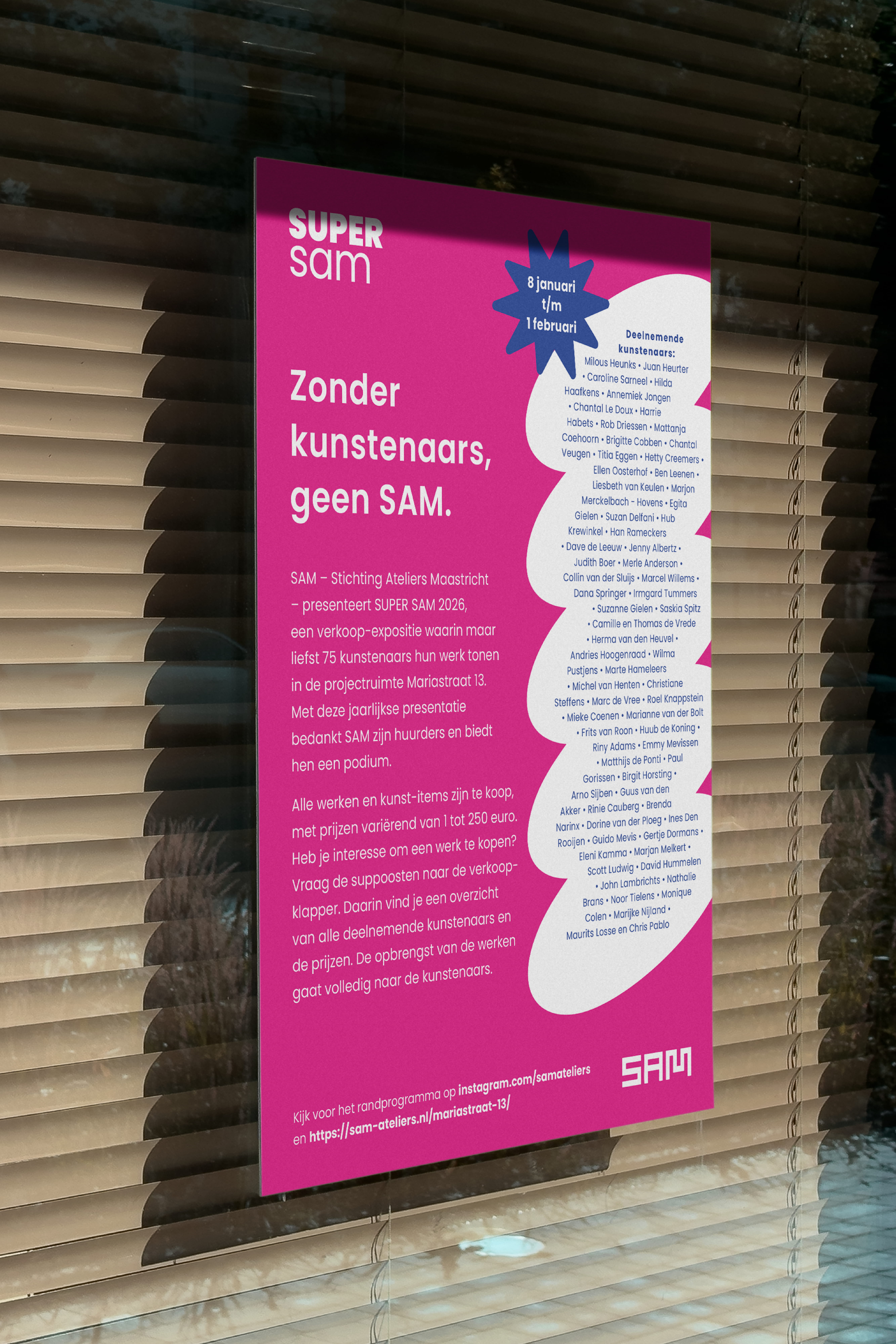
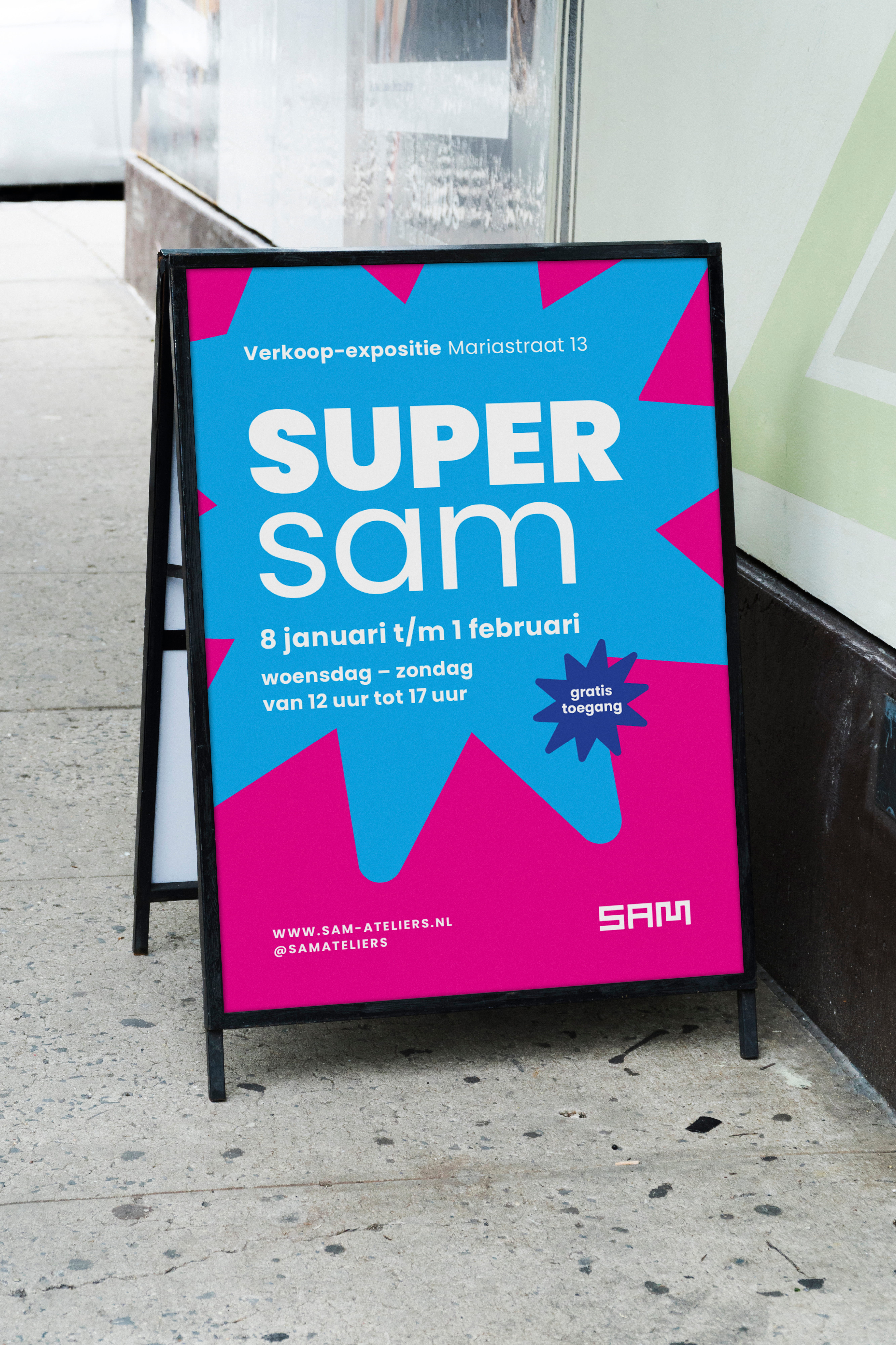
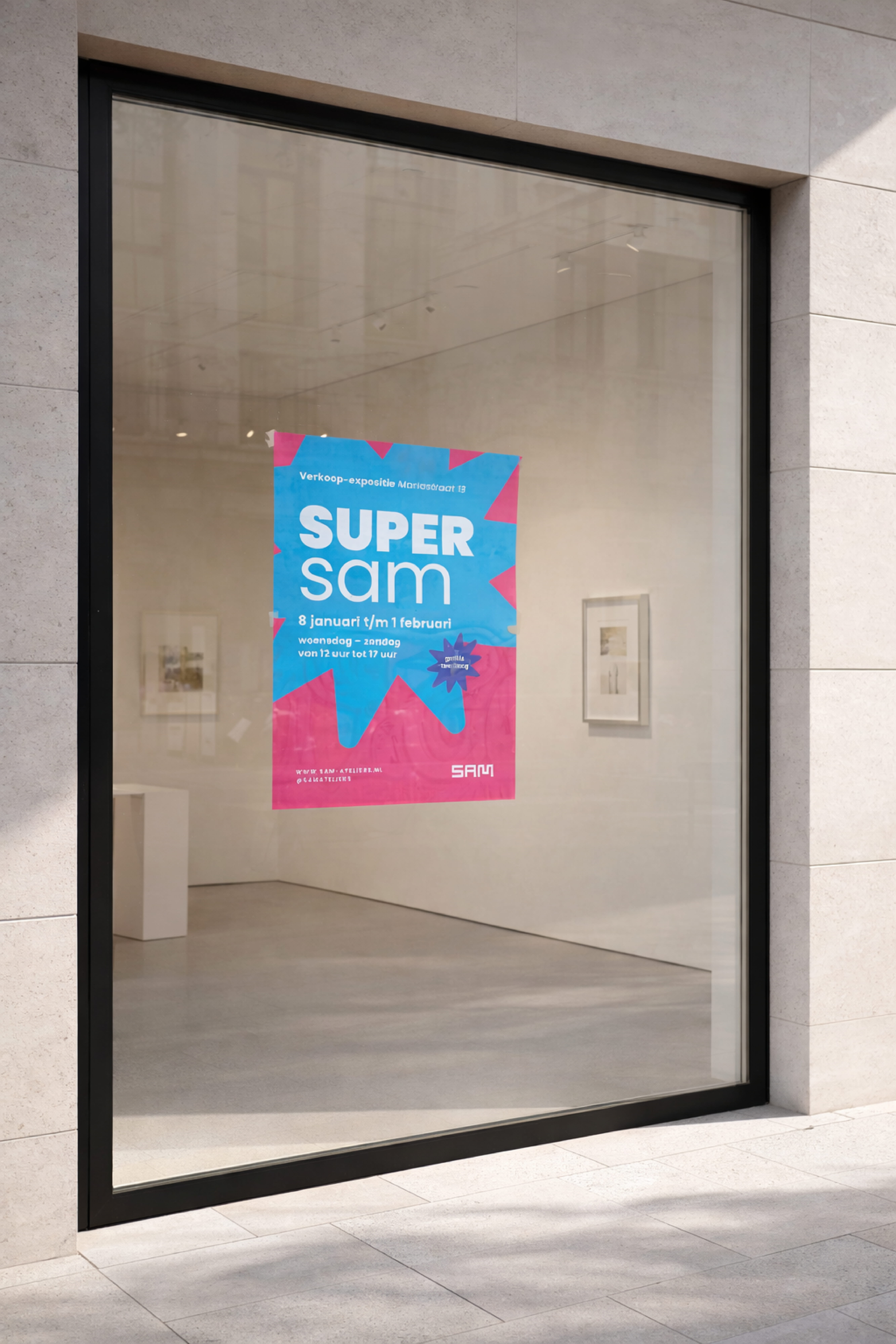
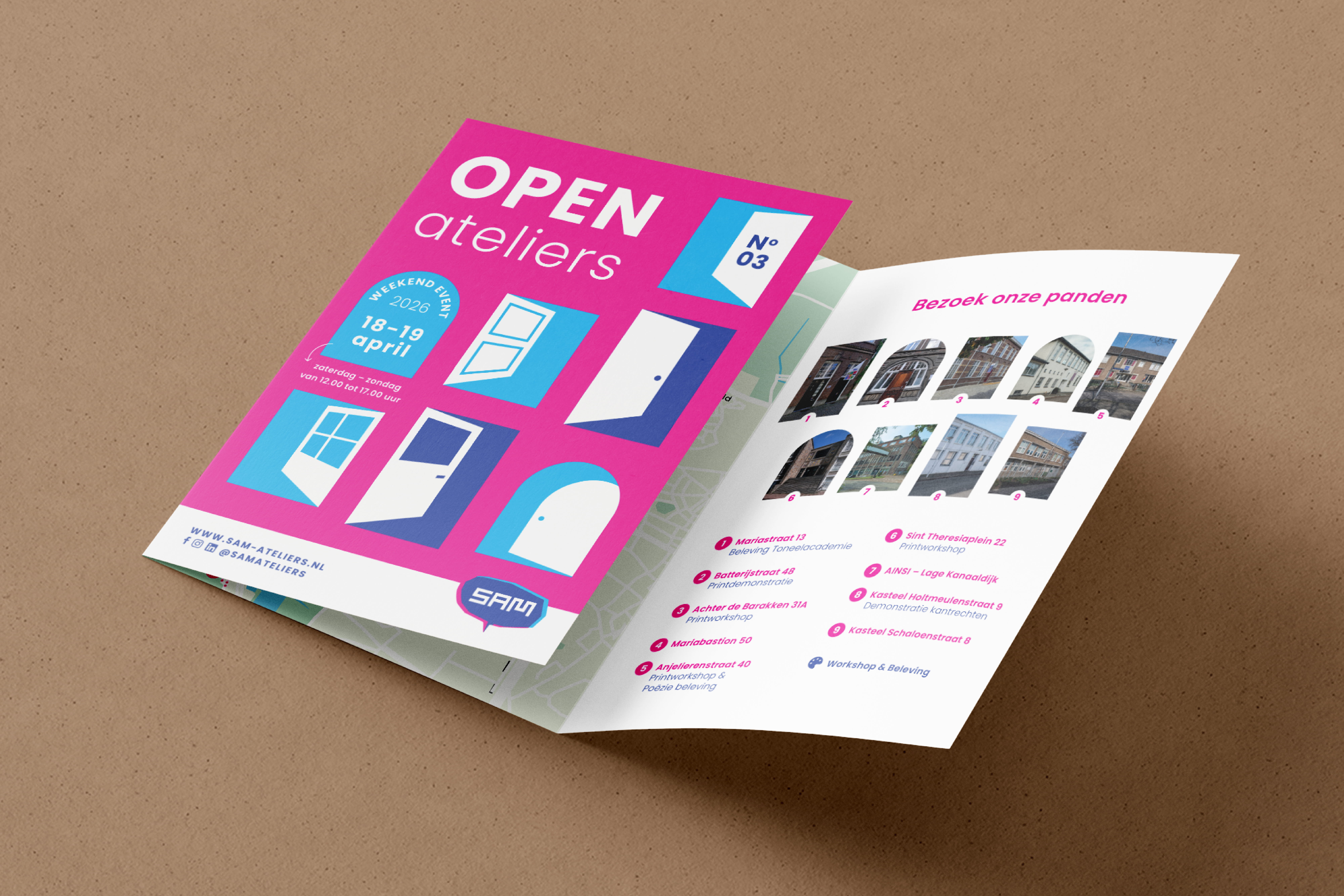
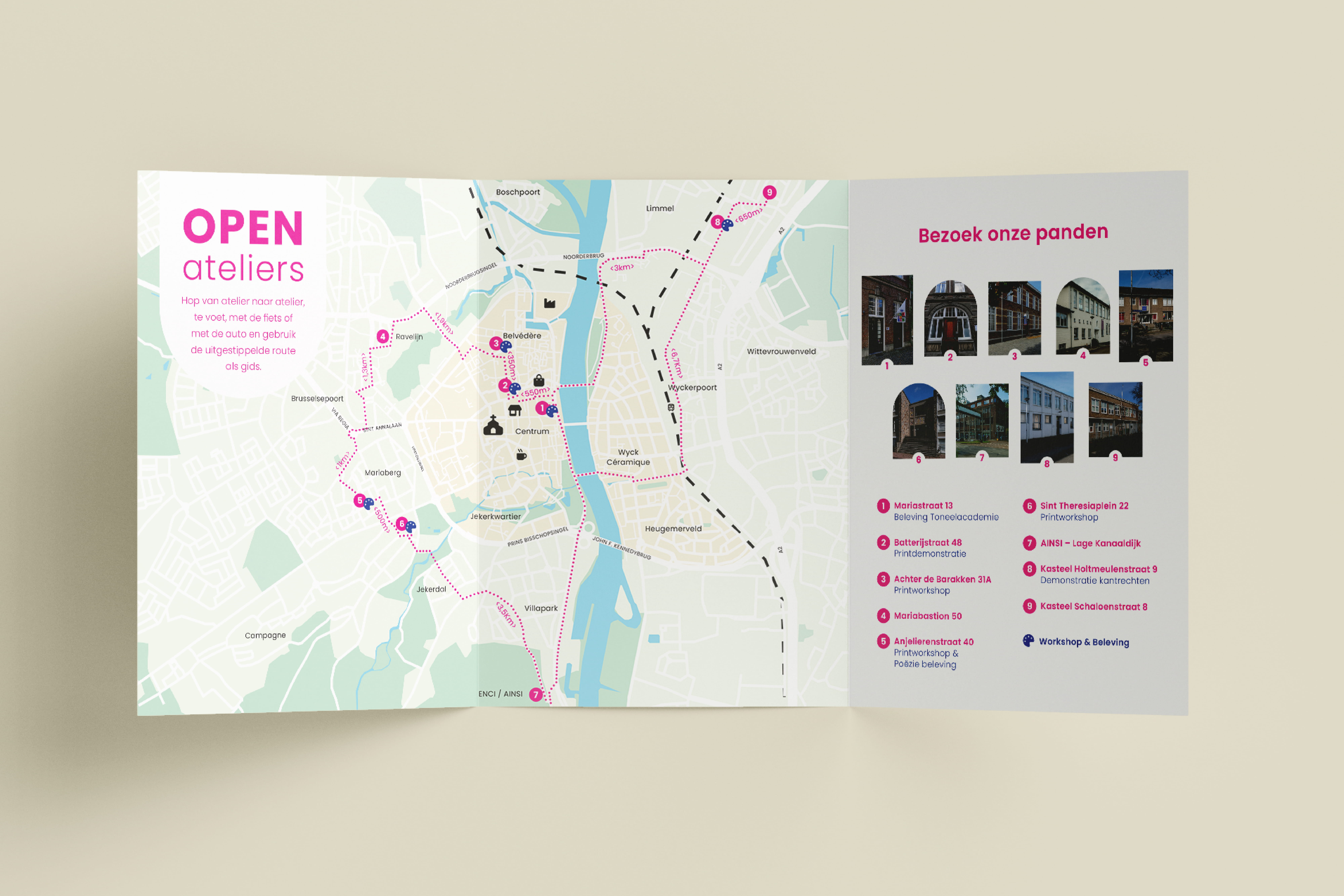
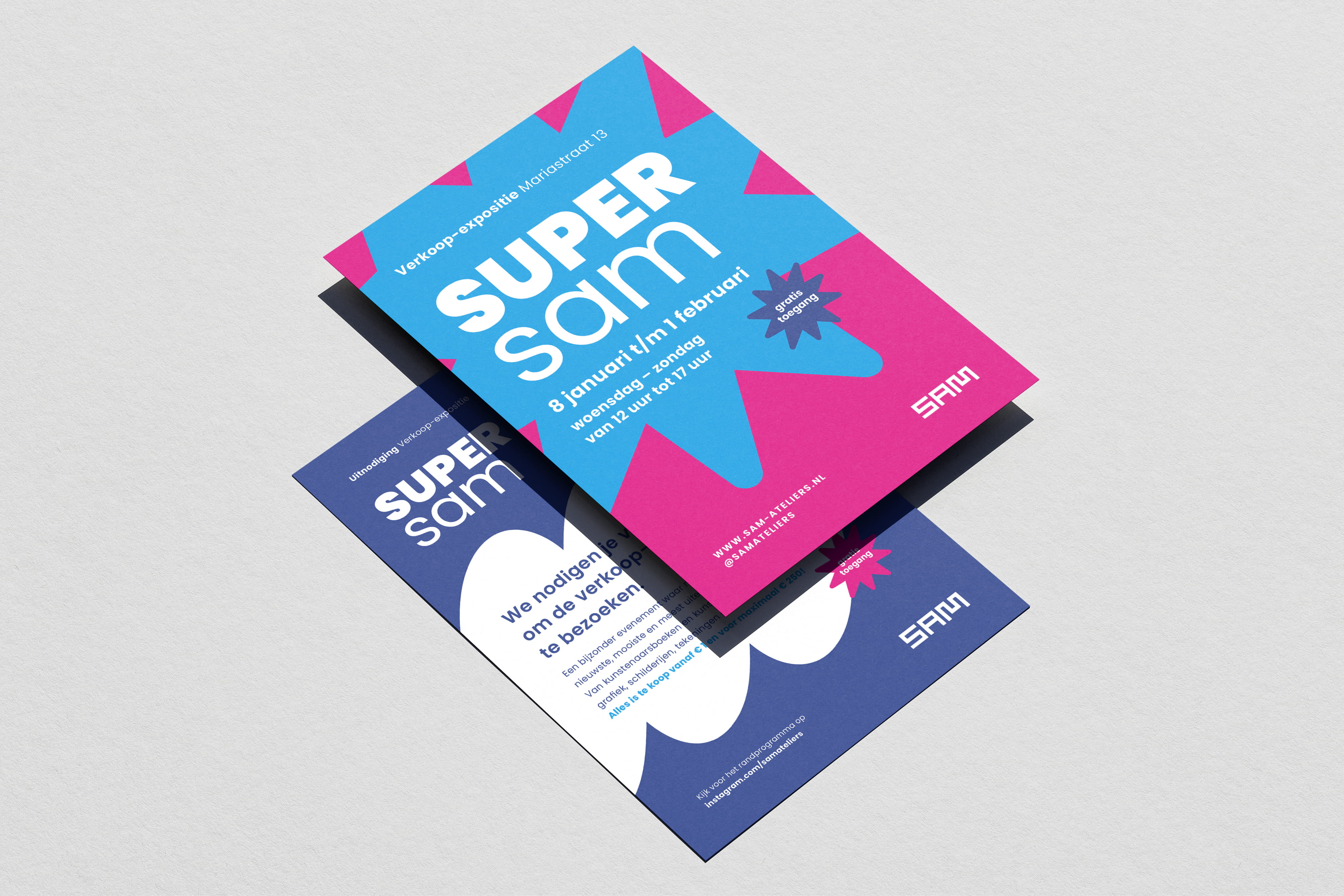
Strengthening SAM (Stichting Ateliers Maastricht) through strategic event branding to ensure high visibility and seamless recognition across all cultural programming.
Built on the existing SAM colour system, the identity was translated into a bold and consistent visual language across posters, signage, cycling routes, folders, flyers, email campaigns and social media templates.
New experience map for a national park in Belgium brings together all key attractions and monuments into a single illustrated overview. Designed within a refreshed visual identity, the system carefully balances typography, colour and composition into one cohesive and recognisable whole.
The illustrations extend beyond the map and were developed into a playful board game, transforming the park into an interactive experience. The game was showcased at the exhibition stand and included in the official tourism brochure, ensuring visibility on both national and international level.
In addition, the illustration set was delivered as a flexible visual toolkit for the involved municipalities and Nationaal Park Bosland, allowing the system to evolve across future tourism and communication materials.
The result is a scalable visual system that connects storytelling, navigation and play, making the national park experience more engaging and memorable across multiple touchpoints.
Where the map ends, the experience begins.


By browsing this site, you agree to the Cookie Policy.