


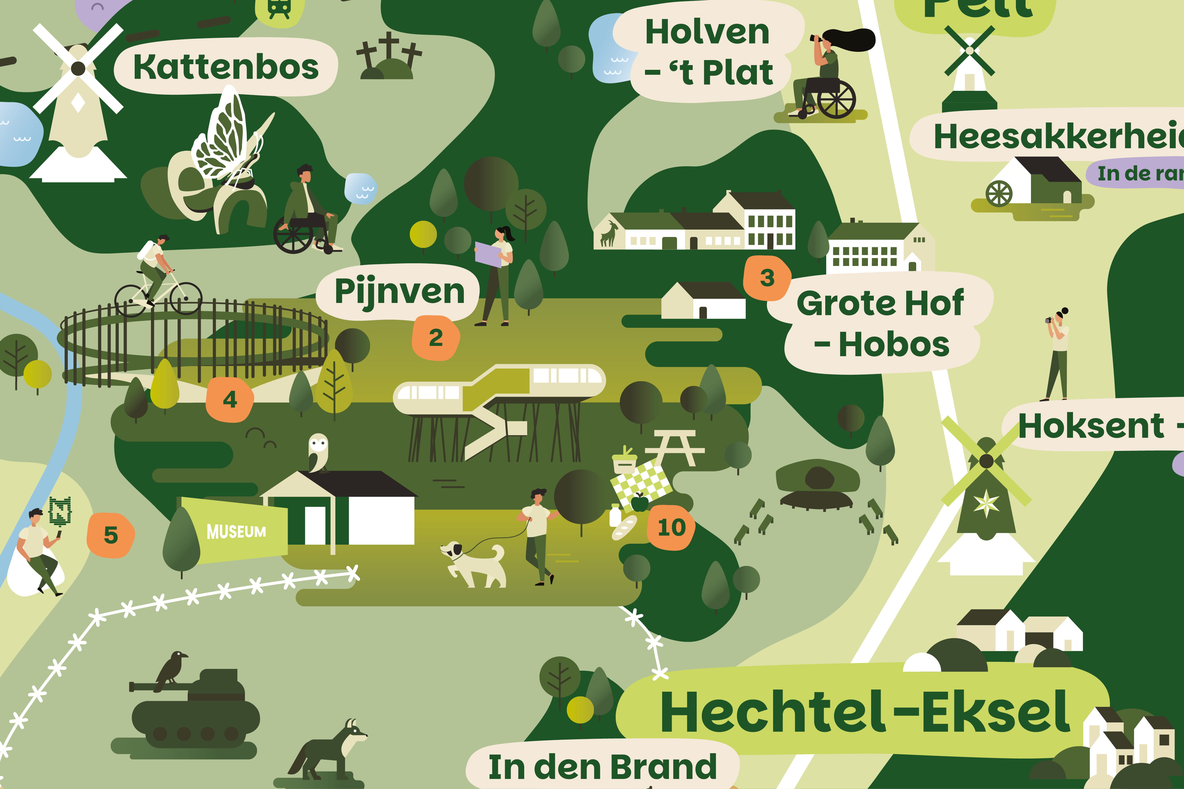
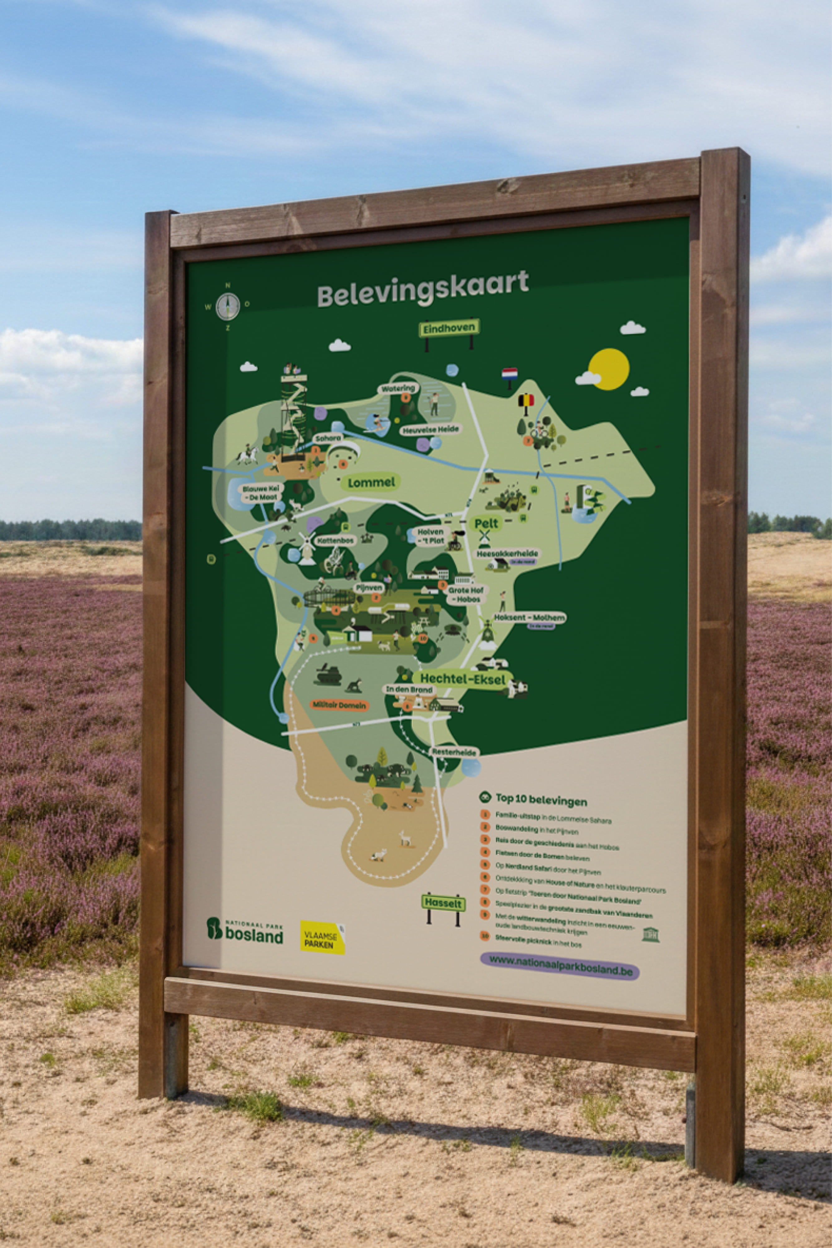
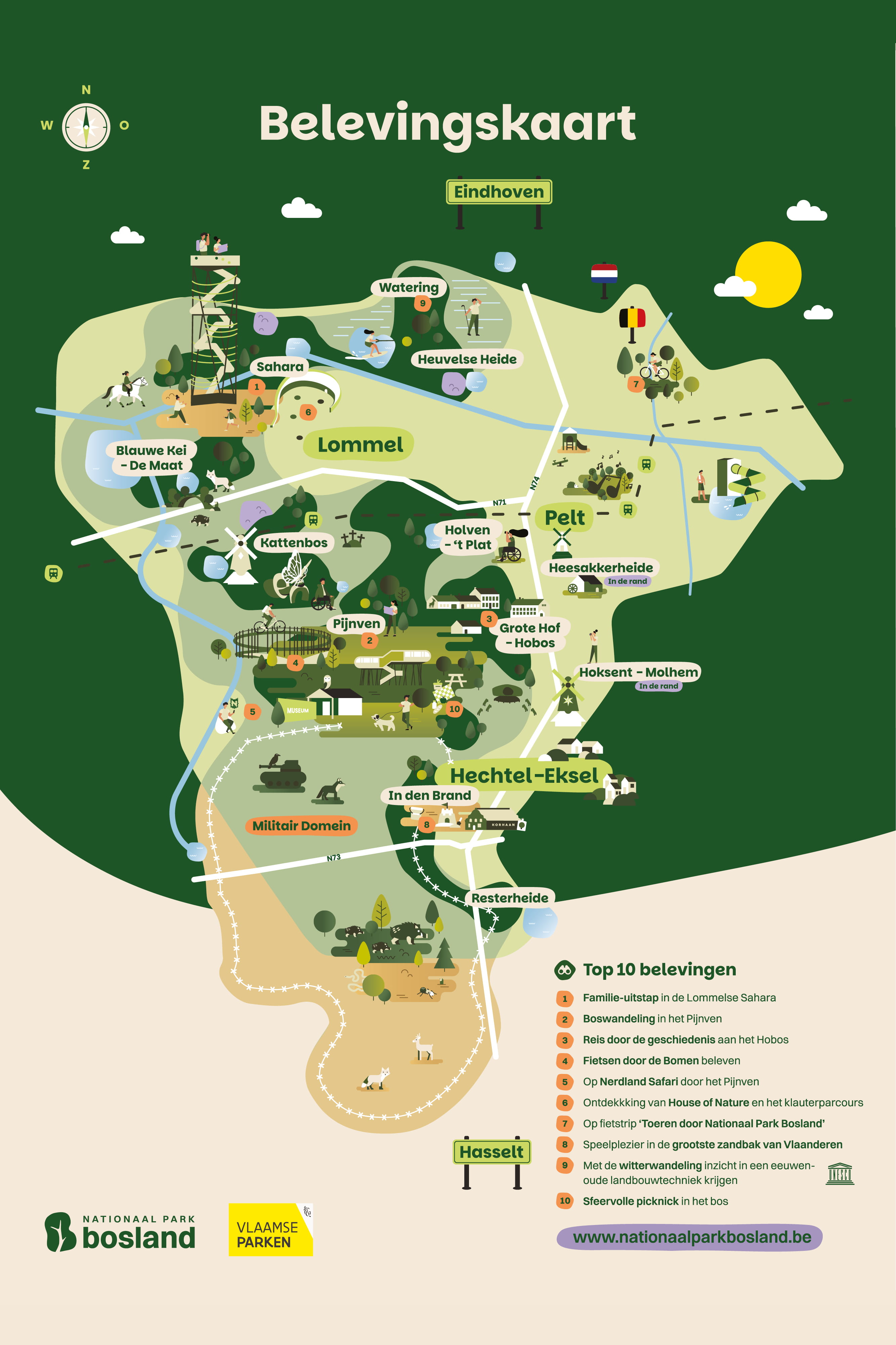
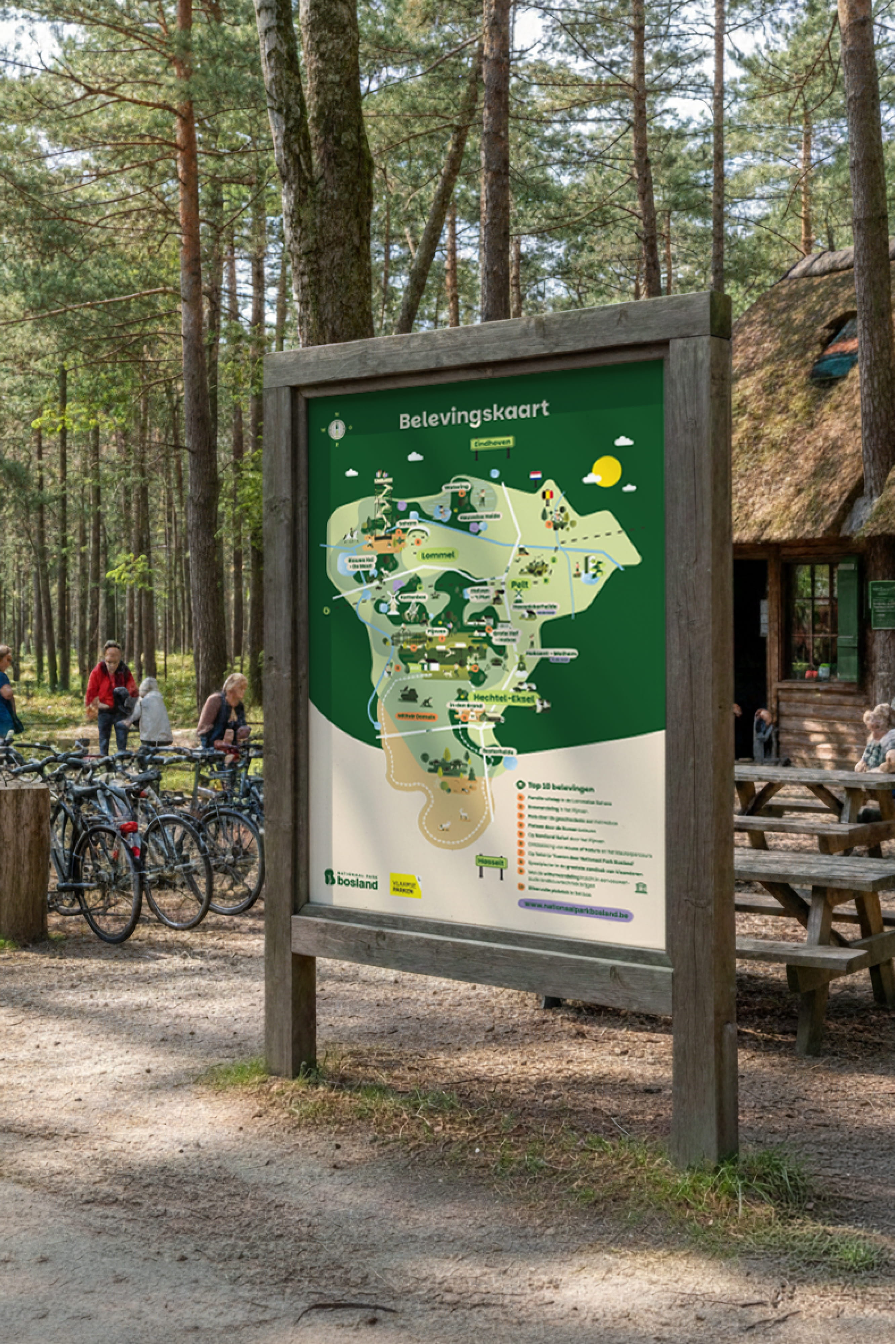
New experience map for Nationaal Park bosland in Belgium brings together all key attractions and monuments into a single illustrated overview.
Designed within a refreshed visual identity, the system carefully balances typography, colour and composition into one cohesive and recognisable whole.
Ten years of GET FIXED called for clarity, not reinvention. A return to the roots, refined into a modern system built for the road ahead.
The identity rebuild focuses on what was always there: movement, simplicity, and function. Stripped back and rebuilt from the ground up, the system separates logotype and icon into two independent but connected elements. Each can stand on its own or operate together as a complete identity system, depending on context and use.
A strict black and white foundation keeps everything sharp and timeless. No noise, no decoration, only contrast and structure. The base is flexible enough to support daily communication and future campaigns without losing consistency.
The system stays disciplined and adaptable across all touchpoints. Business cards, website, print, socials, and day-to-day applications all follow the same visual logic, creating a cohesive but never rigid identity.

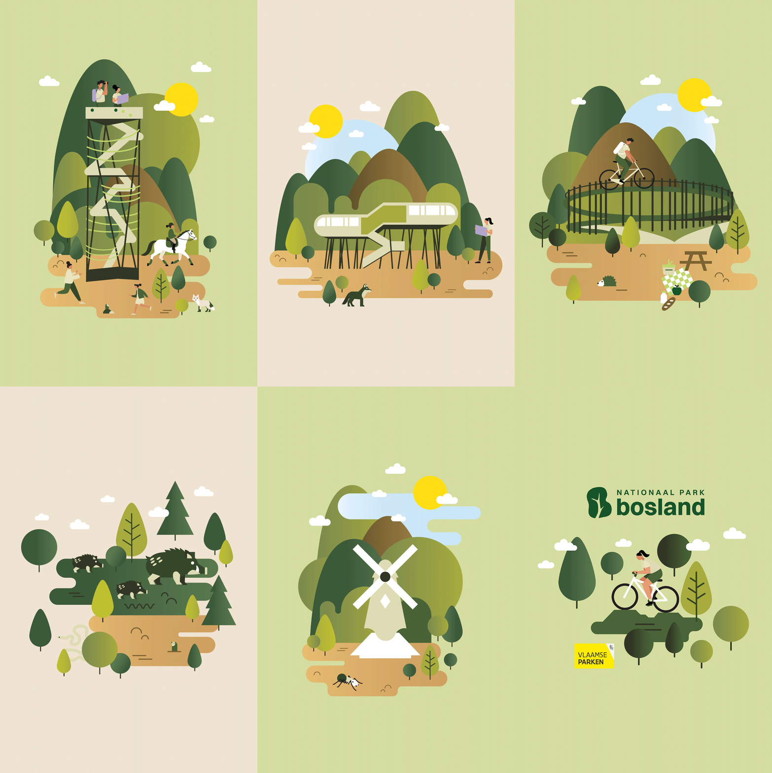
In addition, the illustration set was delivered as a flexible visual toolkit for the involved municipalities and Nationaal Park Bosland.
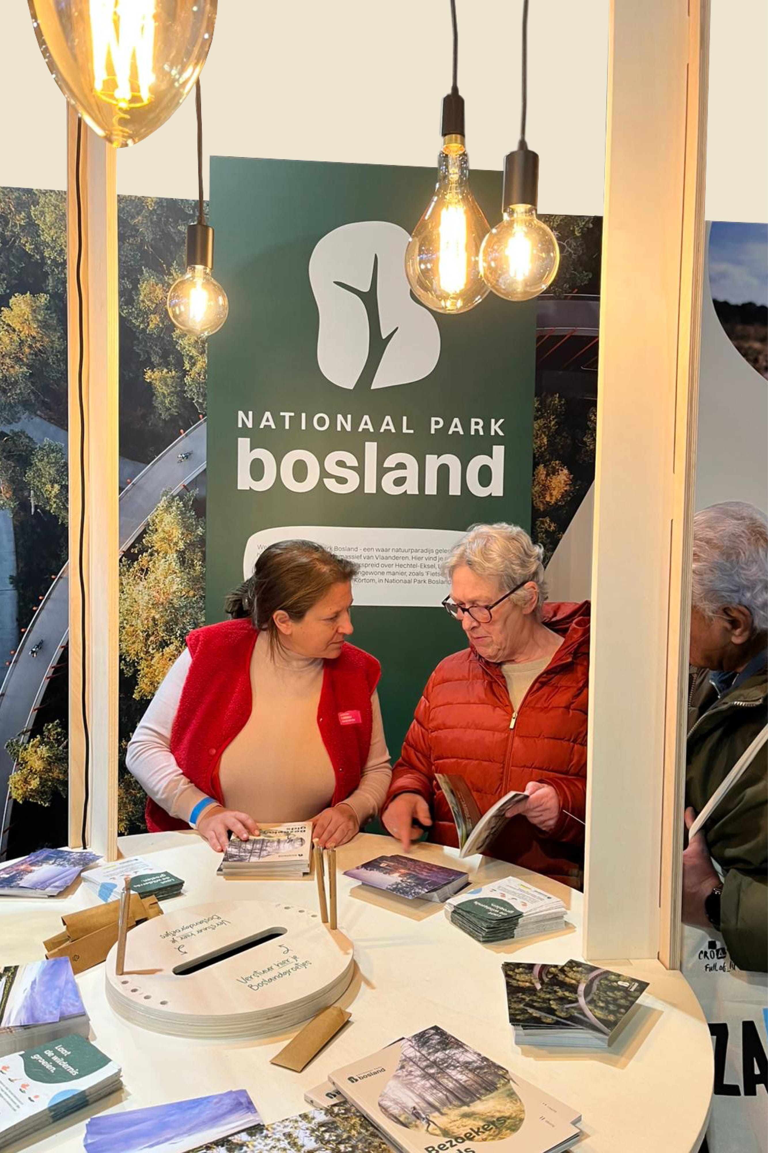
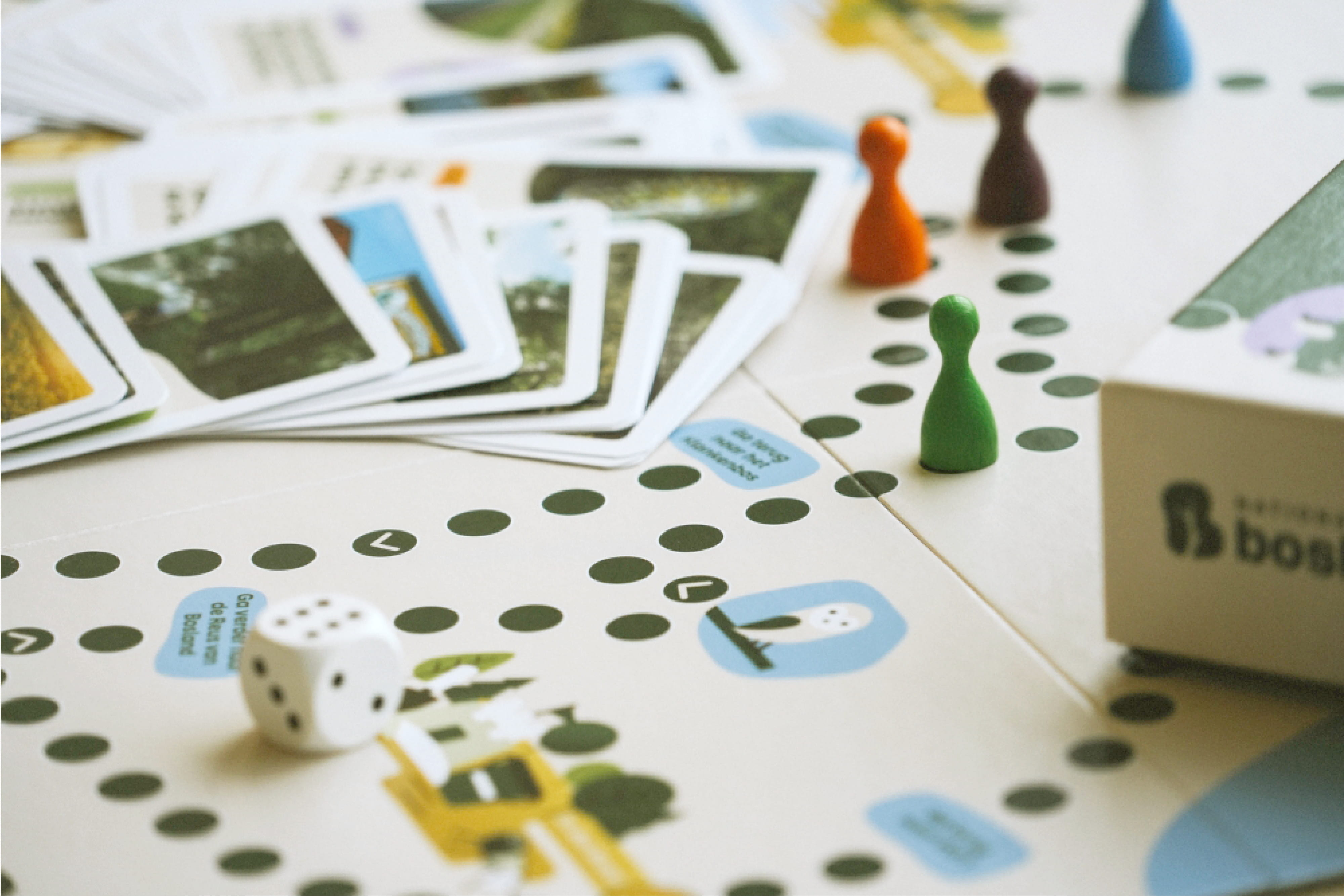
The result is a scalable visual system that connects storytelling, navigation and play, making the national park experience more engaging and memorable across multiple touchpoints.
Where the map ends, the experience begins.
Even the van becomes part of the system. Wrapped in a visual timeline of polaroid moments from the shop’s history, turning movement itself into storytelling.
On top of that, a custom bike design translates the identity back into its most physical form, where system meets performance on the road.
The result is a brand rebuilt from its origins, sharpened for today, and ready for whatever comes next.



By browsing this site, you agree to the Cookie Policy.
