


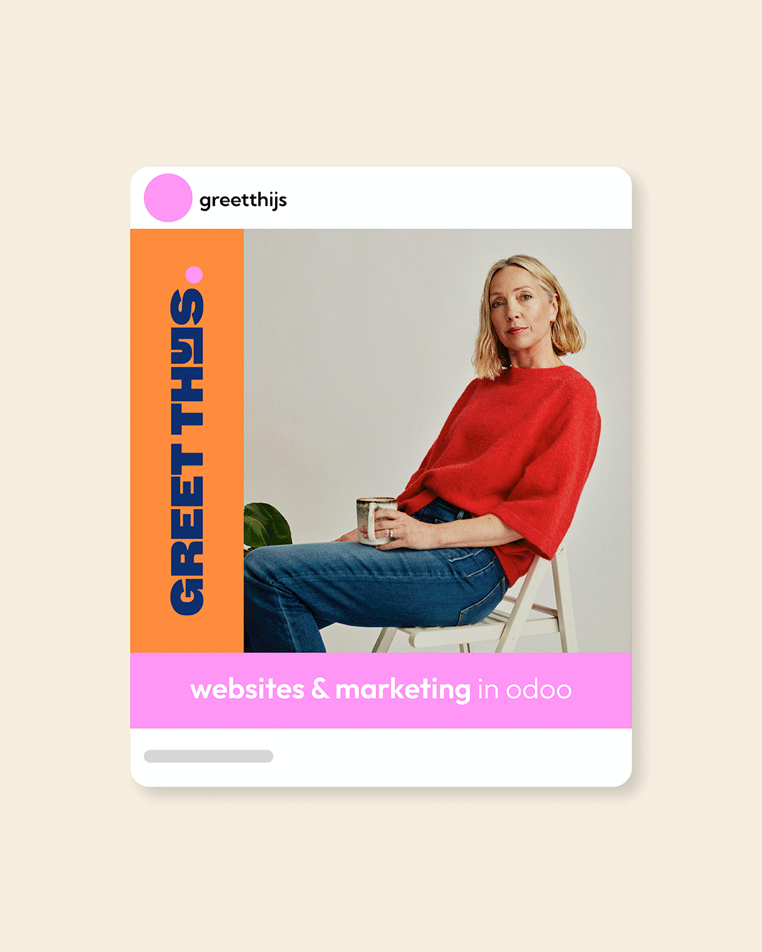
Sometimes a rebrand is not about becoming something new. It is about becoming more yourself.
After years of helping businesses grow through websites & marketing, it was time to step forward under her own name.
A fresh identity under her own name. More personal. More direct. More confident.
Greet Thijs, a name worth standing behind.
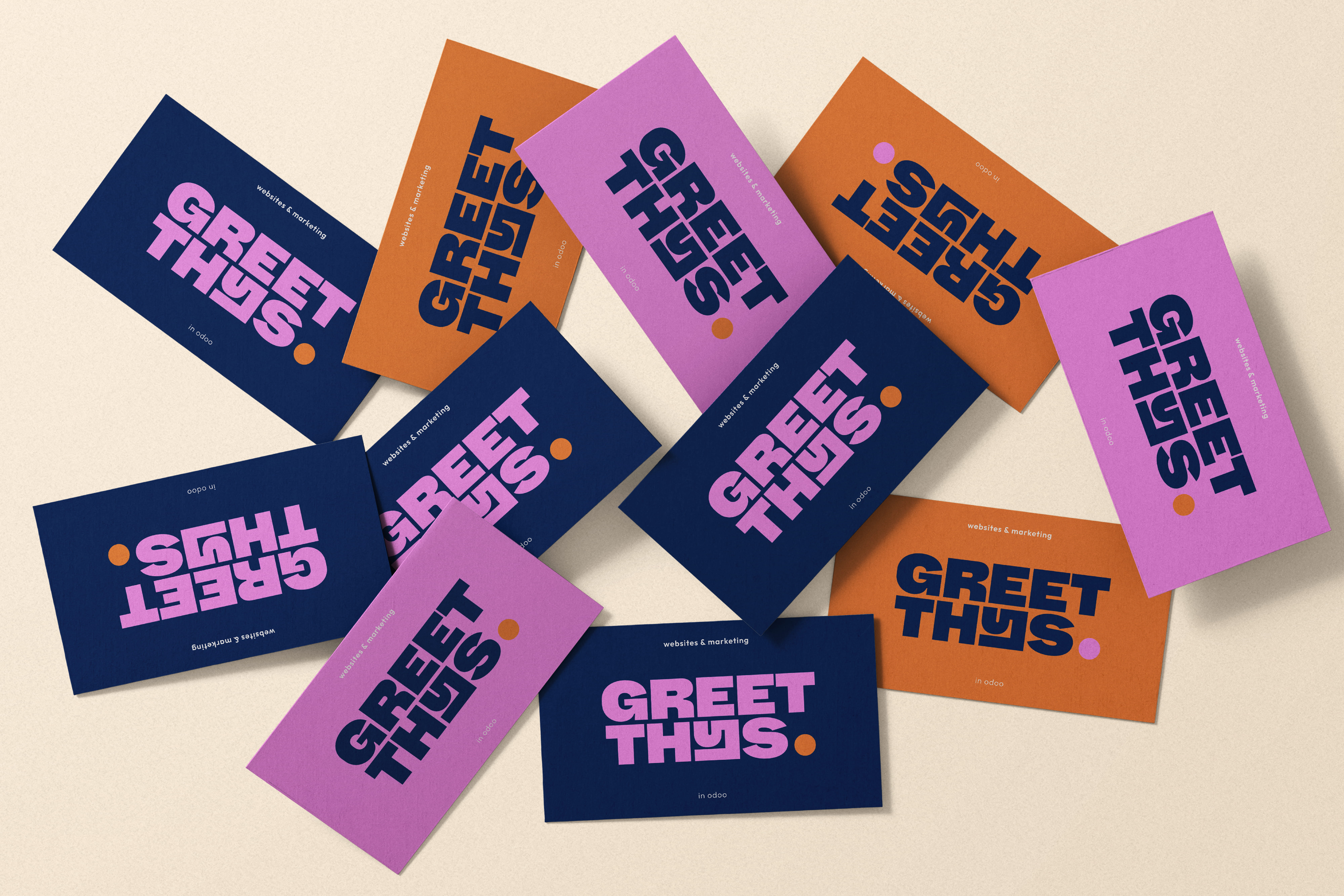
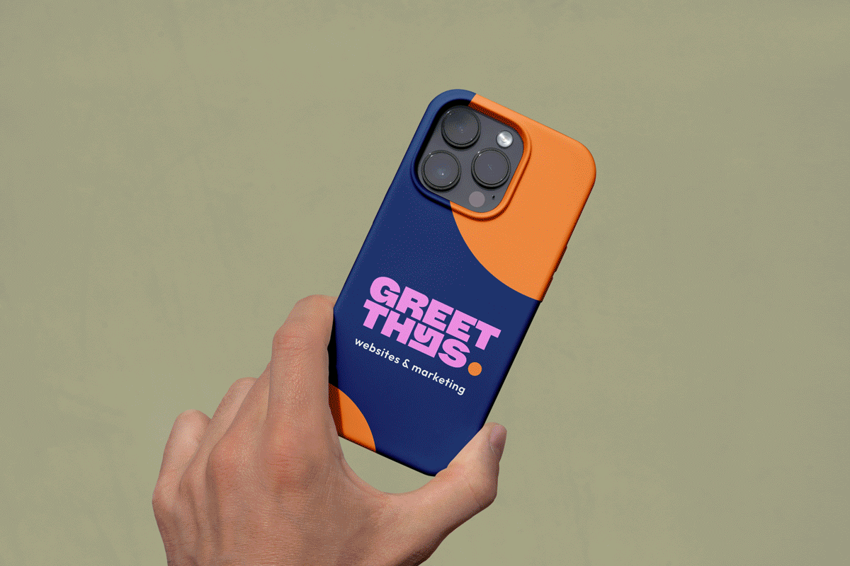
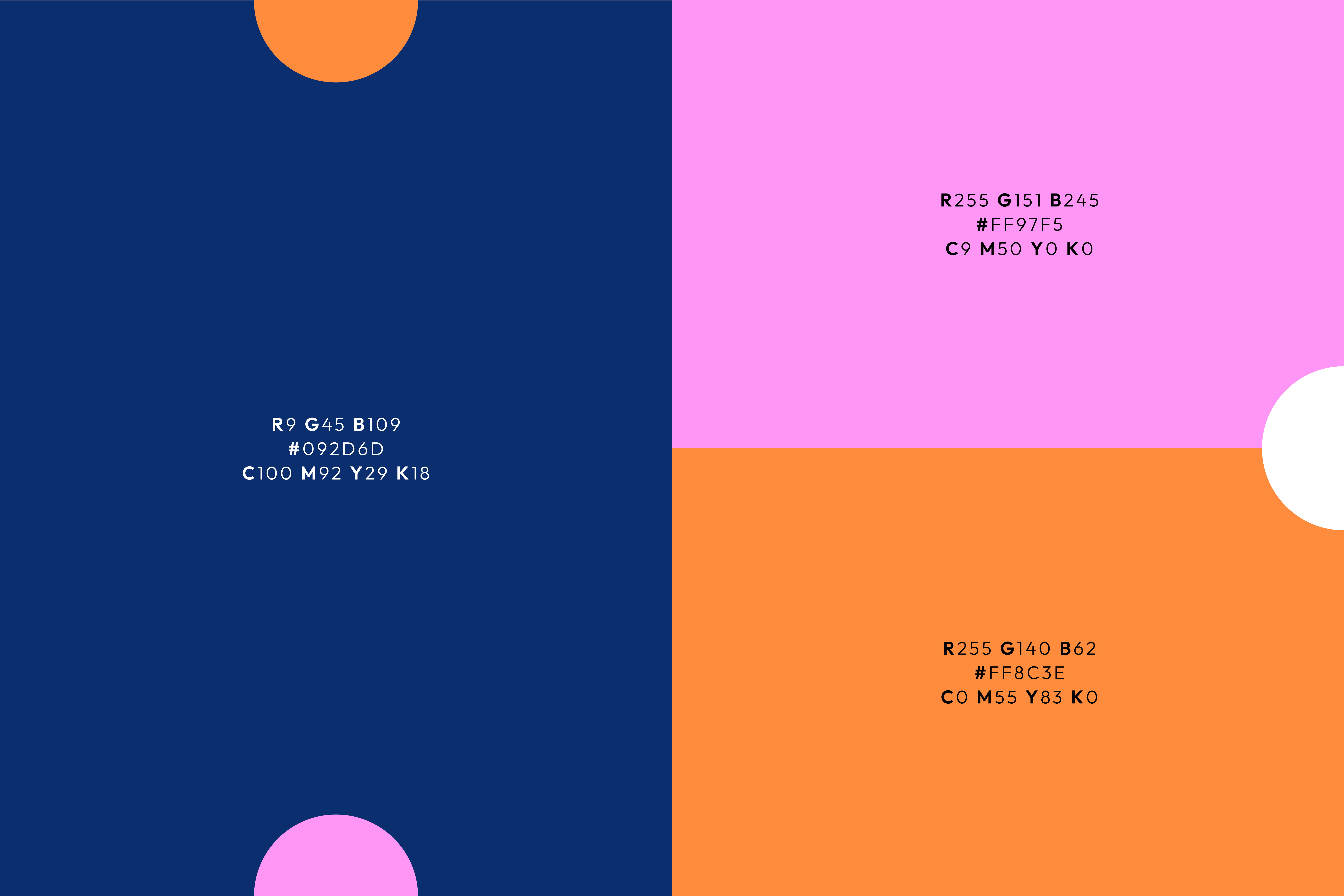

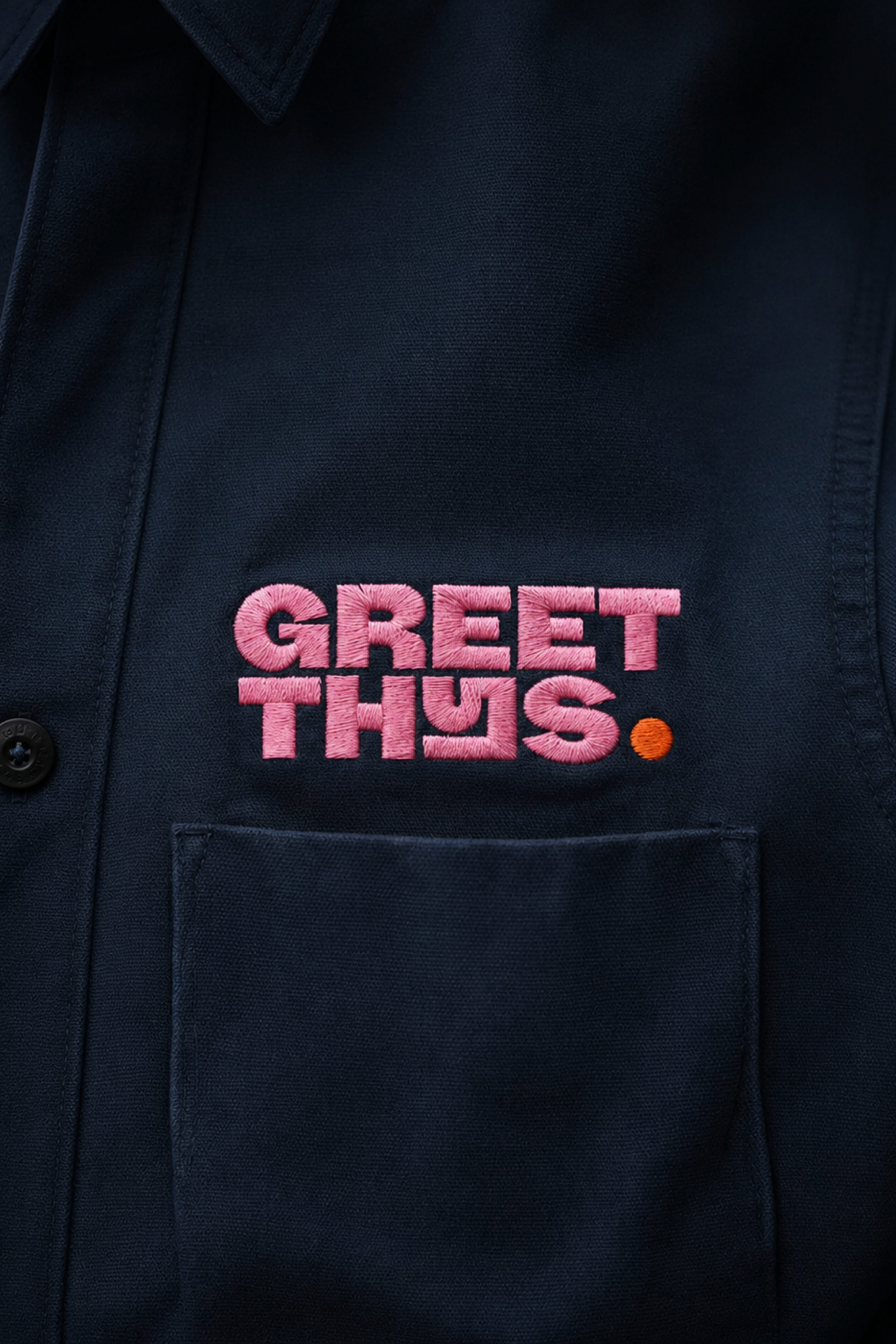
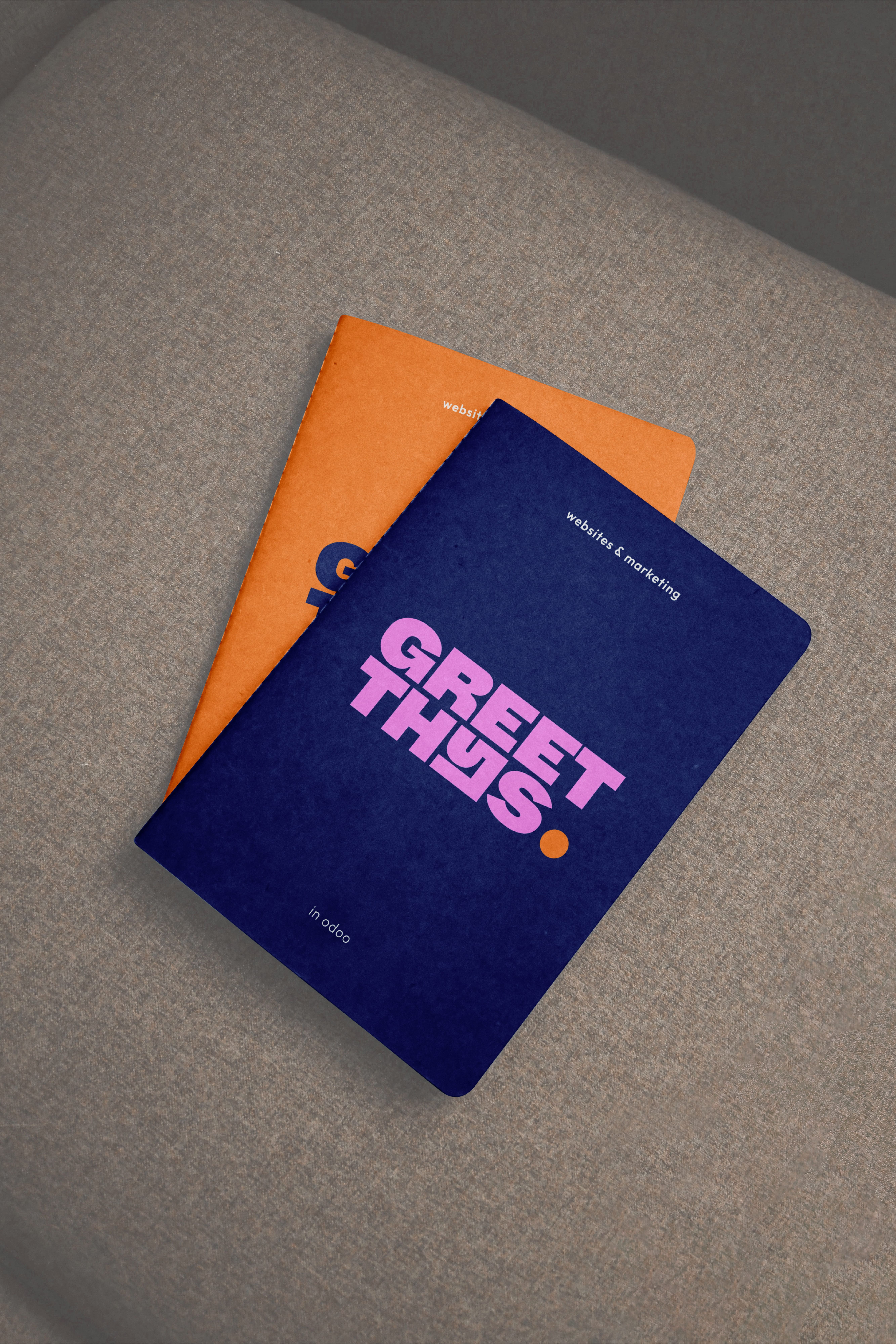
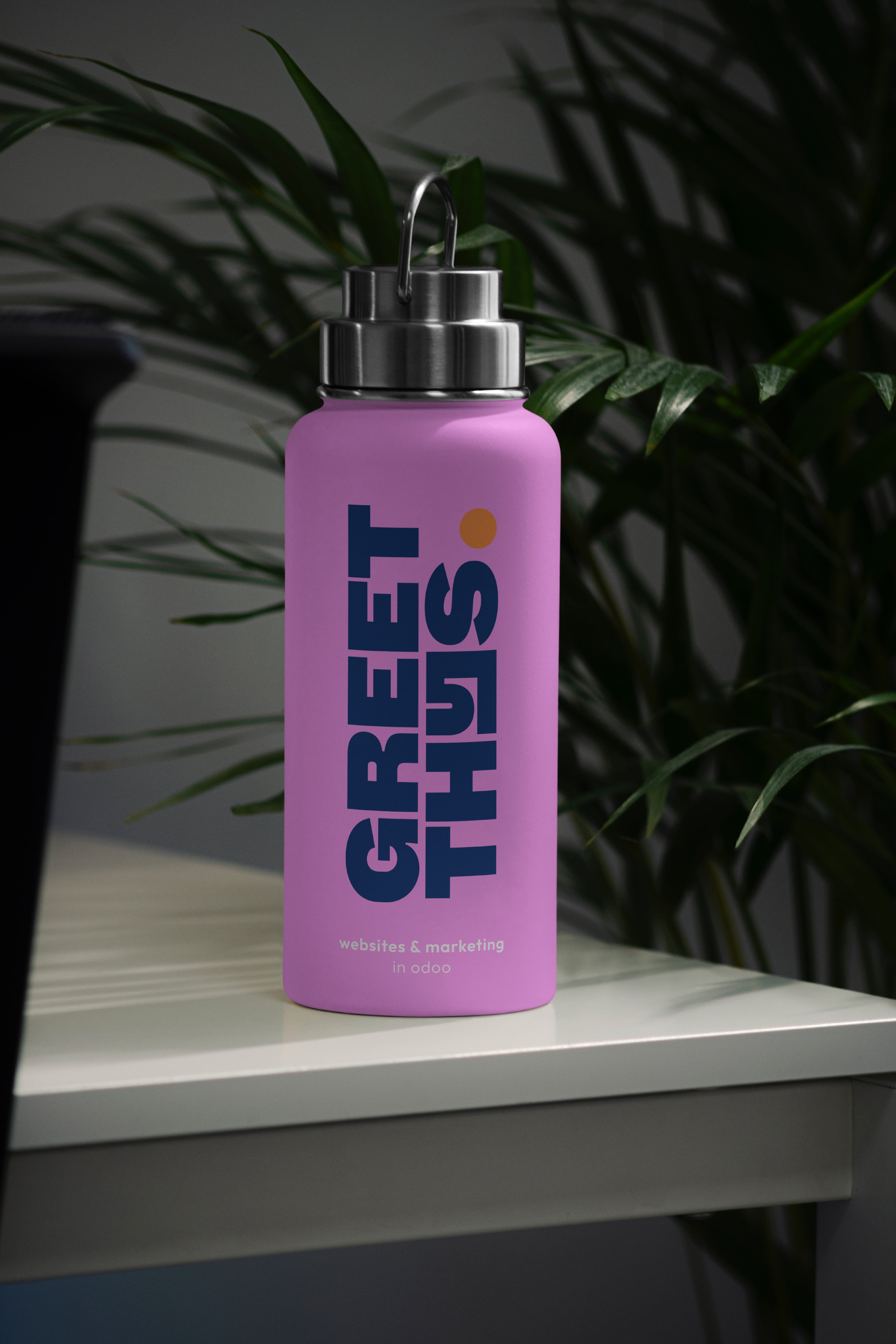
The identity is built around a bold typographic logo. Geometric letterforms create clarity and structure, while playful details add rhythm and character. Rooted by retro typography, refined for a contemporary digital context.
Clean and reliable, with subtle rounded details that keep it approachable and human.
A brand designed to make a statement. Not louder. Clearer.
Sometimes a rebrand is not about becoming something new. It is about becoming more yourself.
After years of helping businesses grow through websites & marketing, it was time to step forward under her own name.
A fresh identity under her own name. More personal. More direct. More confident.
Greet Thijs, a name worth standing behind.
The identity is built around a bold typographic logo. Geometric letterforms create clarity and structure, while playful details add rhythm and character. Rooted by retro typography, refined for a contemporary digital context.
Clean and reliable, with subtle rounded details that keep it approachable and human.
A brand designed to make a statement. Not louder. Clearer.


By browsing this site, you agree to the Cookie Policy.